Improving Safari in iOS 15
Written by
After a few days using the 4th beta of iOS 15 I’m still unable to accustom to the new Safari interface. I’m convinced puting the main GUI in the bottom is the way to go. If there is something our phones have nowadays is vertical space and, the top is pretty hard to reach with our thumbs due to the increasing screen size.
IMHO, the GUI in Safari iOS 15 Beta 4 has a few problems:
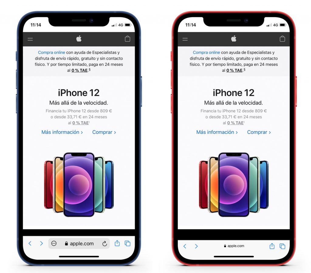
- There’s content under the floating bar (I do not have a better name for it), which isnt’t always accesible.
- It is hard to see the floating bar above the web content.
- There are too many things on the screen at the same time and the horizontal space is decreased due to the lateral margins of the floating bar, which force Safari to use tiny buttons.
- The refresh button, frecuently used, changes its position according to the domain lenght, which play against your muscle memory.

When you scroll throught the website the floating bar morphs into a tiny toolbar, but the animation is so complex that distracts the user focus. There are too many things happening at once.
My proposal
- Use a fixed toolbar.
- Does not hide the website content under itself.
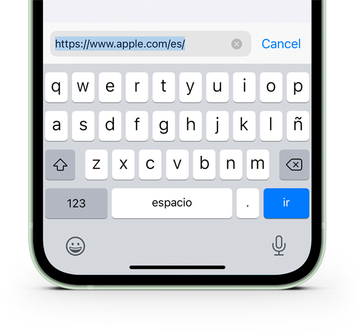
- The domain is shown inside a textfield, which suggests to the user to tap on it.
- Buttons have a fixed place, so you can always reach them without thinking about it.
When you scroll, the toolbar can decrease its height to gain a few extra pixels, but it does in a subtle way without sacrificing functionality.