MetroVLC’s UX/UI little details
Written by
>MetroVLC is an unofficial app I made two years ago to check Metrovalencia’s train schedules.
These days I’m working in a completely new version, written from scratch and I thought is was a nice opportunity to gather a few little details I love about the current version.
The way the origin and destination are exchanged.
Manually changing the theme between light and dark is like switching on and off a light bulb.
The icons are not static images…
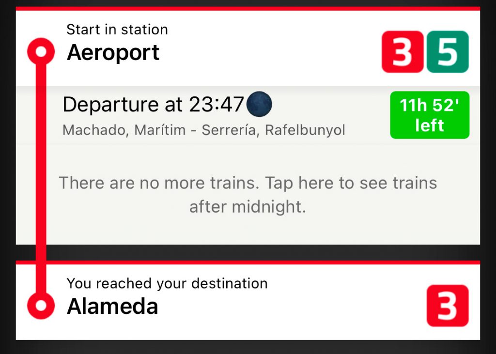
Even the date icon shows the selected hour.
When you press the Show trains buttons, a train animation shows upa while the app get the schedules online. During the animation, the taptic engine simulates the vibrations of an actual train moving on the rails.
If you are in dark mode, the animation shows up a train at night with the interior lights on.
In Valencia people usually speaks Valencian, but I’m not a native speaker, so I apologice in advance for any mistake during translation.
I spent an insane amount of hours in the open card animation…
… and even in the delete card animation (who deletes a card, anyways??)
The card animation is interactive, you can pull it down to close it.
When you search for a station, the list takes the whole screen. If you tap OK when only one station is in the list, the station gets selected.
When a station is no longer your favourite, you breaks its heart.
I spent a lot of time trying to make the app as accessible as possible, but did not achieve the results I wanted. To avoid leaving anyone behind, I created a “simple mode” with big targets for people with motion or vision problems.
The app detects VoiceOver is active when you open it and suggests you this mode, but you can always go there from the settings
The pandemic took out the night train service. Night trains did show up with a Moon emoji and would show the correct moon phase of that day.